How to Design a Successful Logo: Tips for Design Students
Logo design is more than just crafting a visual mark; it’s about encapsulating the essence of a brand in a single, recognizable image. For design students, understanding the nuances of logo design is vital for creating impactful symbols that resonate with audiences.
Today, there are different types of logos and brand images. For example, animated icons are becoming more and more popular in the digital realm – and the Vista Create software provides designers with a convenient logo animation maker. Here’s a deep dive into the world of logos and how to master their design.
1. Deep Dive into the Brand’s Essence
Before sketching or conceptualizing, dive into understanding the brand’s core. What are its history, values, and unique selling points? Familiarize yourself with its mission and vision. This foundation ensures that your design choices are informed and aligned with the brand’s ethos.
2. Simplicity Reigns Supreme
The most iconic logos, such as those of Apple, Nike, or McDonald’s, excel in their simplicity. They’re easy to identify and recall. While it’s tempting to add intricate details, remember that logos often appear in varying sizes and contexts. A simple design ensures clarity and recognizability.
3. Timelessness Over Trends
While it’s essential to be aware of current design trends, a logo should be timeless. Brands like Coca-Cola have logos that have remained largely unchanged over the decades, proving that a well-thought-out design can stand the test of time.
4. Versatility is Vital
Logos appear everywhere, from business cards to billboards. A successful logo looks good in all contexts, whether it’s monochrome or color, digital or print. Test your designs in various formats to ensure they retain their integrity.

5. The Psychology of Color
Colors are powerful communicators. They can evoke feelings, set moods, and communicate ideas. For instance:
- Blue often represents trust;
- Green is associated with nature or growth;
- Black exudes luxury.
When selecting colors, think about the emotions and messages they convey. Also, consider cultural interpretations of colors; what’s auspicious in one culture might be taboo in another.

6. Typography Tells a Tale
When incorporating text into your logo, choose fonts that align with the brand’s personality. A tech startup might opt for a sleek, modern typeface, while a law firm might prefer something more traditional and authoritative. Always ensure that the font remains legible across sizes and mediums.
7. Sidestepping the Clichés
In the realm of logo design, certain tropes are overused. Globes for international businesses, swooshes for dynamic enterprises, and light bulbs for ideas are just a few examples. While these symbols aren’t inherently bad, they can make your design feel generic. Challenge yourself to think outside the box.
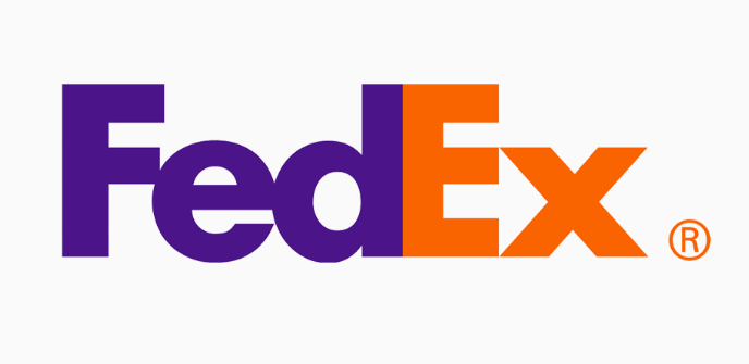
8. The Power of Negative Space
Negative space, the areas around and between design elements, can transform a logo from ordinary to extraordinary. When used creatively, like in the Toblerone logo (with its hidden bear) or the FedEx logo (with its concealed arrow), it can add an element of surprise and depth.
9. Iteration and Feedback
Your first design is rarely your best. Sketch multiple versions, play with different elements, and then seek feedback. Fresh perspectives can provide invaluable insights, helping you refine and perfect your logo. Iterative design, combined with constructive feedback, is the path to excellence.
10. Continuous Learning and Adaptation
Logo design, like all art forms, evolves. New tools, techniques, and trends emerge. Stay updated by attending workshops, reading design publications, and analyzing successful and evolving brands. Continuous learning ensures your designs remain fresh and relevant.
11. Understanding the Competition
Researching competitors’ logos can offer insights into industry trends and help you differentiate your design. Your logo should stand out in a sea of competitors, and understanding the landscape can provide a clearer direction.
12. Symbolism and Storytelling
Every curve, color, and element in your logo should tell a story. For instance, the Amazon logo has an arrow pointing from the letter ‘A’ to ‘Z’, indicating they have everything from A to Z, while also forming a smile. Think of how you can incorporate stories or messages within your design.
13. Avoiding Over-Polishing
While refining your design is crucial, there’s a risk of over-polishing, where the logo loses its authenticity and charm. Strive for perfection, but also know when to step back.
In summary, logo design is a journey that marries creativity with strategy. Each logo is a unique challenge, demanding understanding, imagination, and technical skill. By following these tips and continually refining your craft, you’ll be well on your way to becoming not just a logo designer, but a brand storyteller.
Cover from Aleks Dorohovich